How to Spot Manipulative 'Dark Patterns' Online
Hard-to-find settings and confusing language can lead you to buy, share, or receive more than you want. This guide can help.

Anyone who’s tried to close an Amazon account knows that breaking up is hard to do. The instructions are buried under a help menu, and once you track them down, you learn there’s no way to complete the process on your own. You need to contact customer service to get the job done.
It’s not just Amazon. Websites large and small often choose designs that make it difficult and time-consuming to limit data collection, choose strong privacy settings, or simply stop receiving marketing emails.
Privacy experts call design elements such as hard-to-find buttons and confusing menus “dark patterns” when they seem to manipulate consumers unfairly. Harry Brignull, a designer who is credited with coining the phrase, maintains a "Hall of Shame" where people have contributed screenshots from organizations as diverse as PayPal, National Geographic, Quora, and a company that sells first-aid kits.
Woodrow Hartzog, a Northeastern University professor of law and computer science, examines dark patterns in his book "Privacy’s Blueprint" (Harvard University Press, 2018). “In the aggregate,” he says, the practice “amounts to this collective machine that is trying to extract every ounce of data and value from us."
Dark patterns aren’t always intentionally misleading, says Cliff Kuang, author of the forthcoming book "User Friendly" (Virgin Digital, 2019) and a product designer at Google, who was not speaking on behalf of the company. “There are lots of reasons that dark patterns happen, some of which are inattention, some of which are just institutional drift, some of which are malicious, and some of which are shortsightedness,” he says.
The Warning
Consumer Reports Consumer Reports
We’re all familiar with alert boxes. If you try to close a Microsoft Word file without saving your work, a box pops up to remind you that you could lose your work. A classic use of the alert box is the one that appears before you empty the trash on your laptop, prompting you to think twice before doing something irreversible.
“Usually you save that type of action for potentially harmful things, like unintentionally deleting something,” says Jared Forney, a UX researcher and expert on dark patterns who works at Okta, a company for single-sign-on and similar services. “It intentionally introduces a moment of hesitation.”
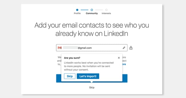
But alert boxes can also be used to act as persistent salespeople. One example is shown above. When you create a new LinkedIn account the platform prompts you to import your email contacts. Click “Skip” on that screen, and the pop-up shown here makes a pitch for reconsidering, with the “Let’s Import!” message highlighted to draw your eye.
Like other companies, LinkedIn employs such contact lists to suggest people for users to connect with, helping to grow users’ networks and the company’s membership at the same time.
How it could be better: Forney would like to see this alert box eliminated. “If I hit skip, I'm skipping,” he says. “I’m not going to change my mind.” Using an alert box here implies incorrectly that skipping the step is a risky move that might create hard-to-fix problems, he says. Forney would also like the page to reveal how your contact list will be used—without requiring you to navigate to another screen.
What LinkedIn says: “We’ve found that members who build a network of connections that they know and trust are significantly more satisfied with their experience on LinkedIn, so we added a confirmation to ensure that the step to import email contacts isn’t overlooked,” says Damien Coullon, director of product and head of growth at LinkedIn. Coullon points out that LinkedIn members can remove contacts and permissions whenever they wish, and that LinkedIn provides details about how contacts are used through “Learn More” links you see during sign-up, and throughout the site.
Illusion of Control
Consumer Reports Consumer Reports
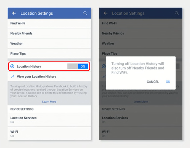
Privacy settings don’t always do what you expect. These screenshots show the Location History toggle in the Facebook app’s privacy settings (left), plus the pop-up you see when you switch it off (right).
A Facebook user might think that “Location History” lets you control whether Facebook keeps track of where you go. But if you turn it off, Facebook may continue using your phone’s GPS data to track your location. (You can turn off the app’s access to GPS through your phone’s operating system settings—but Facebook can still figure out your rough location using other information, including your IP address.) The company uses location data for ad targeting.
So, what does the Location History setting actually do? With the setting turned on, Facebook says, the company will maintain a time-stamped history of where you go. The company can use the information to target you with what it considers “relevant” ads, while also providing features such as “Nearby Friends” and “Find WiFi.” Turn Location History off, and those location-based user features will be disabled. However, the company may still use your current location for advertising.
That’s confusing, according to Justin Brookman, CR’s director of privacy and technology policy. “A user might turn off ‘Location History’ because it's brightly illuminated, read the description below the toggle, and not really understand how the company’s actual access to your location works,” he says.
How it could be better: “By default, Facebook shouldn't be getting geolocation data,” Brookman says. “You should have the option to turn it on if you want to use one of the niche features” such as Nearby Friends. Further, he says,the Location Settings page should provide more complete information—along with a single control that stops all forms of location tracking by the company.
What Facebook says: “We disagree with the idea that this is a ‘dark pattern.’ People choose in their OS whether Facebook can access their device’s precise location (and on iOS, when we can),” a spokesperson says. “If people have chosen to allow us to access their device’s precise location, they can then choose to let us know whether to store a history or only use their current location. . . . Some products like Nearby Friends require access to background location for this reason . . . our intent is to be as clear as possible.”
Default to Public
Consumer Reports Consumer Reports
Tens of millions of Americans now use peer-to-peer (P2P) payment apps. In addition to convenience, these service offer some social features.
For instance, when you use Venmo to send money to a friend, you need to include a note. You might say that dinner was fun or that this payment is your back rent, or maybe just insert an emoji instead.
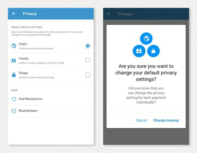
Some users may be surprised to find that those notes can be read by anyone—not just the payment’s recipients or other friends. The amount of money exchanged is private, but when you use the app with the default settings, the company displays all the notes, including user names, in a social media feed that’s visible to the public.
Consumer Reports evaluated the privacy and security of five leading payment apps in 2018, and Venmo earned a very good Overall Score. But we cited this setting as a privacy concern. “You probably wouldn’t even realize it’s public until, say, an ex-boyfriend sees your payments to a new guy and starts to bother you,” said Eason Goodale, lead engineer at Disconnect, a security firm based in California that helped conduct our P2P testing.
In 2017, design technologist Hang Do Thi Duc used this information to create a website that documents, in startling detail, the lives of several Venmo users—including a Santa Barbara cannabis dealer, and a doughnut superfan with buddies in Texas and Mexico City.
You’re not stuck with the public setting. You can switch from the default option so that only your Venmo friends can see your payments, or only you and the recipient. However, if you do that, you get a pop-up that asks whether you’re sure you want to change your default privacy settings. Click this control, too, and your setting gets changed. (We also described this type of pop-up box above, under “The Warning.”)
Additionally, you can make any particular payment more private when you send it, and you can go back later and change the visibility of previous payments.
How it could be better: Your payments to friends should be as private as possible when you sign up, says Forney, the UX researcher. If you want to share the information publicly, he says, you should need to adjust the settings. With that arrangement, Venmo would ensure that no one is sharing personal information inadvertently. At the least, Venmo should make you choose a setting as part of the setup process, he believes, rather than just explaining how the system works. “That would definitely be a big step in the right direction.”
What Venmo says: “The safety and privacy of Venmo users and their information is always a top priority,” a Venmo spokesperson says. “Venmo was designed for sharing experiences with your friends in today’s social world, and the newsfeed has always been a big part of this. . . . Venmo has no plans to make changes to the existing feed or social experience that our users engage with and love.”
The Obstacle Course
Consumer Reports Consumer Reports
When you go into a department store, some things are easy to get to, and some things aren’t so easy. Historically, cosmetics have been located near the entrance on the main floor, in part to generate impulse purchases. It might not be quite as simple to find luggage or furniture, let alone a bathroom.
Websites are like that, too.
Amazon may be the best company in the world at making things easy. The company’s process for returns is simple, and Amazon set a new standard for ease-of-use with its 1-Click ordering. “The best customer service is if the customer doesn’t need to call you, doesn’t need to talk to you. It just works,” Amazon CEO Jeff Bezos has said.
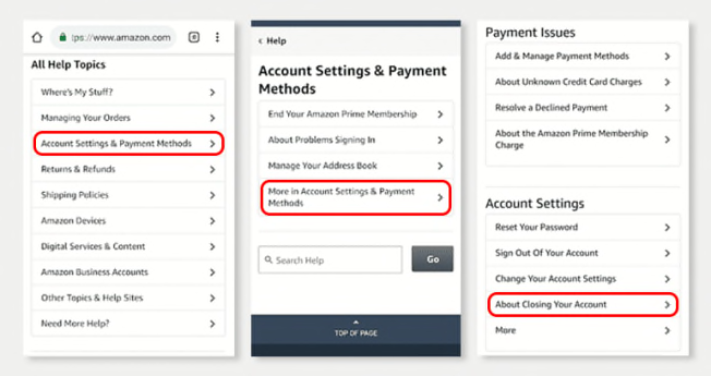
One exception to Amazon’s “no call” guideline is the process for closing an account. Go to Amazon’s main settings page (Account & Lists) and you can quickly change your payment options, track a package, and more. But it can take a lot of hunting and pecking through menus to find instructions for saying goodbye to the company, as depicted in the image above. (To be fair, if you think to type “close account” into the main Amazon search bar, you can save those steps.)
Once you arrive at the About Closing Your Account page, there’s a surprise waiting for you. There’s no “Close my account” button. Instead, you find a long list of negative consequences you’re likely to encounter if you proceed. And, at the bottom, there is a link to the general customer service page. Once there, you encounter another tricky process for initiating a phone call or chat with an Amazon representative.
“This makes it much harder for a consumer to exercise choice,” CR’s Brookman says.
How it could be better: Brookman calls the process “evasive” and says it should be much easier for consumers close an account if they want to. “There should be an automated process where you can do this without having to reach out to someone,” he says.
What Amazon says: Customer service reps can “securely and easily” help customers close an account, and will do so immediately upon request, an Amazon representative said in an email.
The Speed Bump
JCrew/NA JCrew/NA
Compared with some examples of dark pattern design, this “unsubscribe” page is more of a speed bump than a road block. It’s an example of how websites and apps can use design cues that play against your expectations. Depending on the scenario, this might encourage you to buy more, accept more marketing communications, or provide more information.
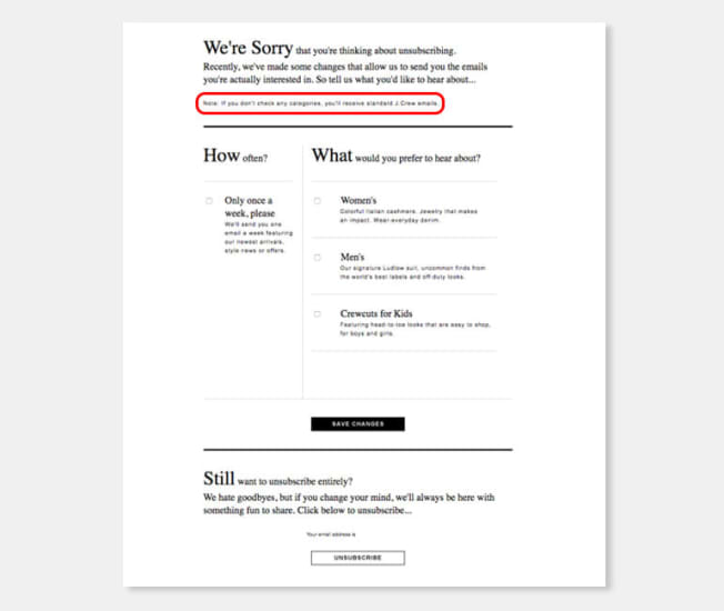
You get to this page by clicking the Unsubscribe link at the bottom of an email from the clothing retailer J.Crew. If you’ve used similar controls before, you might expect the the small type after “We’re Sorry” to read “to see you go,” or something similar. It would be easy to assume that you’re now unsubscribed.
But simply clicking the email link doesn’t unsubscribe you, and neither does the “Save Changes” button you see highlighted. To stop receiving emails, you have to read through your options and then click the white box at the bottom of the screen.
“These are the subtle tricks of user interface design,” Hartzog, the Northeastern University professor, says. “We shouldn't look at this in isolation, but rather within an entire ecosystem of people who are demanding we go through extra clicks and make extra decisions” to exercise consumer choice.
How it could be better: The unsubscribe button should be much easier to spot on this screen, according to Hartzog, since that’s what the user is looking for. “You want to have one button press that solves all future correspondence, full stop,” he says. “No extra comprehension or decision making required.” If the company wants to offer more personally tailored options, he suggests, they should come below.
What J.Crew says: The company declined to comment.
Editor's Note: To learn how Consumer Reports collects and uses consumer data, please see our privacy policy.


